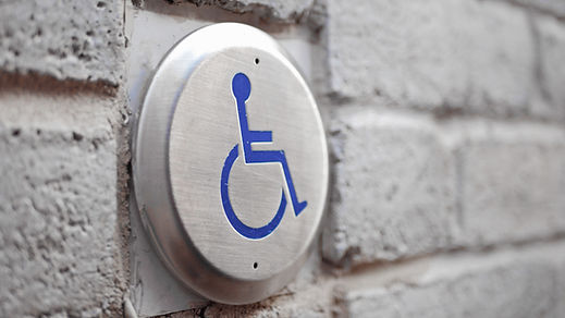

ADA SIGNAGE
A quick reference of some rules and requirements of the Americans with Disabilities Act (ADA) when it comes to signage.
ADA-compliant signs in public spaces play a crucial role in enabling individuals with sensory disabilities to navigate areas safely and effectively. These signs must include elements such as pictograms, tactile text, Braille, or a combination thereof. To assist you further, we have listed the key regulations for creating ADA-compliant signs below:
1. High Contrast and Non-Glare Finish: ADA signs must have a strong contrast between the content and the background, along with a non-glare finish.
2. Clear Font: Text characters in ADA signage should be in a clearly distinguishable sans serif or serif font. Avoid using italics, condensed or extra bold fonts.
3. Grade 2 Braille: Signs marking or identifying public areas should include Grade 2 Braille, allowing individuals with visual impairments to read the information. Note that Braille spacing and sizing standards may vary by state.
4. Pictograms: If applicable, ADA-compliant signs should include appropriate pictograms, such as symbols for stairs, restrooms, or wheelchair accessibility.
5. Letter Size: The height of the text characters in ADA signage should range from 5/8 of an inch to 2 inches.
6. Tactile Characters: The tactile characters on the sign should be positioned at a height of 48 to 60 inches from the ground, measured from the base of the characters.
In addition to following these regulations, there are suggested best practices that can help create more effective ADA signage. For instance, maintaining a high contrast ratio of at least 75 LRV (light reflectance value) between the background and content is recommended. In low-lit areas, signs with dark backgrounds and bright content improve visibility. Overhead signage should be repeated at eye level, and consistency in textures, colors, and text enhances usability. Care should also be taken to avoid visibility issues caused by lighting shadows when signs are hung.
To avoid common violations, it is important to pay attention to character spacing. Incorrect spacing between text, pictograms, or Braille is a frequent error. By ensuring the spacing between characters exceeds the norm, compliance with the regulations can be achieved.
Ultimately, our goal is to help you create ADA-compliant signs that are easily distinguished and understood. By respecting the rules and understanding the importance of compliance, we can help you produce excellent ADA signage that benefits everyone.*
Landmark Grafix will help you create the signs you need. Send us a message with your needs or if you'd like to request a consultation fill out the contact form.
footnote: Benjamin Roussey, Published September 3, 2020, accessibility.com, web page.


